
 Visit
Visit Give
Give


CEI Brand Guide
As College of Eastern Idaho (CEI) continues to grow, questions continue to pop up regarding its brand. Within this style guide's pages are vital tips on how to represent the College accurately. Making our brand successful and authentic depends on each employee. Although any brand has so much more to it than visuals, these are key components to our identity as CEI. Just as the College is always looking to innovate, we’re planning for the future with this style guide. There is so much to work towards, and this is another resource to help you be successful!
- Mission Statement
- CEI Values
- Visuals
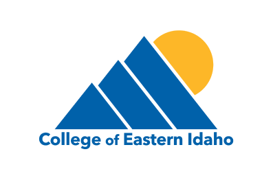
- Official CEI Logo
- CEI Seal
- Sun Dot Logo
- Student Organizations
- Department Logos
- Color Pallete
- Typography
Mission Statement
To provide open-access to affordable, quality education that meets the needs of students, regional employers, and community.
Core Values

Learning for Work and Life
CEI is a place of learning where students prepare for transfer, careers, and effective citizenship. The college embraces active learning, and provides instruction that is not only academically rigorous, but also tailored to the needs of the student and the community. Learning for work and life takes place in all areas of campus through transfer degrees, career-technical education, college and career readiness, and workforce training.

Student Centered
CEI faculty and staff throughout the college are committed to students and their success. Well-functioning student support areas are critical to students' success because they help model outstanding professional behaviors, and they provide comprehensive student support from first contact through degree and/or employment.

Community Engagement
CEI's focus on community is evident in a safe and inviting campus, which fosters communication, professional growth and adult enrichment through broad, collaborative relationships within academic and employer communities throughout the region.
CEI Values
Our Mission Statement and Core Themes define us as employees. With them, we have direction in how we make choices and conduct ourselves at work. They also give the College a pristine vision of our goals and the future we hope to build here in Eastern Idaho. CEI is clean and modern. We strive for quality in our employees, students, opportunities, campus, and education. We believe that form follows function, and that innovation is key to keeping relevant in the world. Everything a CEI product contains should add to the overall message. Distracting or contradicting values should be removed or revised to better align with CEI’s values. We want our reputation in the community to be one of trust and excellence in what we bring to the table. These should be reflected in all we say, do, and produce. Ask these questions throughout the process of decision-making, a project, review, or analysis to see if it’s reflecting CEI values:
- Does it benefit CEI students?
- Does it allow CEI employees to more easily fulfill their duties?
- Does it foster engagement with the community?
- Does it promote education?
Visuals
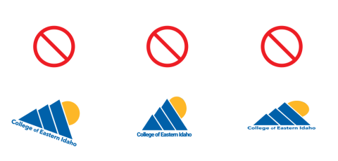
Visuals should lend themselves to CEI’s Mission and/or Core Themes, and be high quality. They should also stay on the simpler side to effectively communicate. Always make sure to check licensing rights and policies on images. Most images found on Google are illegal to use, and CEI should uphold a tradition of quality and trust. Visuals should not be used to create logos or to insinuate or mimic CEI logos. Logo Creation comes from the Marketing Director. Do not use borders, boxes, angled text, clip art, or other distracting or dated elements.
Acceptable options:
- Circles! Especially yellow ones, which call back to the sun dot.
- Squares and rectangles are welcome also, where circles are impractical
- A string of yellow dots is a fun, on-brand text divider on occasion.
- For formal pieces, a straight yellow line is the preferred divider

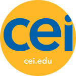
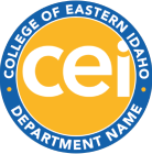
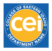
Official Logo Usage
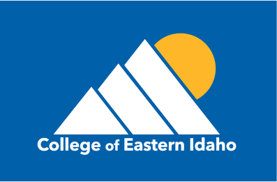
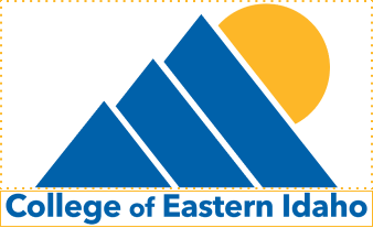
Both the square and rectangle orientations are official, though the rectangle version is preferred wherever possible as it better reflects the academic nature of the College. Using the blue or white version of the logo depends on your work’s background; always choose based on visibility. Remember to always keep the logo visible.
Print Media
CMYK Colors
PDF File
Web Media
RGB Colors
PNG, JPG, SVG File
Color Schemes
Please use the full-color logo as much as possible. The black and white logo is made available for black and white printing. The yellow and white logo should be used in situations where the full-color logo has low visibility.
Square vs. Rectangle
For small spaces and general use, the original square logo is appropriate. The longer, rectangular logo is a more scholarly version, especially good for items such as official letterheads and large-scale events. Both are official logos for CEI. Any other variation of these two logos should be deleted.


A grayscale version also exists for black-and-white products.
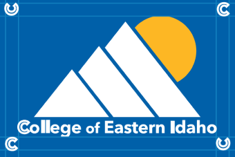
Safe Space
Keep the logo separate from other text and graphics. Determine minimum clear space with the “C” in the word “college”.
Resizing
Enlarging the logo should always be done in Adobe Illustrator, or with a .pdf file. These formats prevent pixilation when resizing.
Never increase the size in this format.
Proportional resizing is called scaling. To achieve proper scaling in nearly any computer program, you grab an image by its corner, hold the SHIFT key, and drag to the desired size. The correctly resized logo only looks different in its size.
Logos should not be printed smaller than 0.5 inches tall.
For screens, logos should never appear smaller than 30 pixels tall.
When embroidered, they should never be sewn smaller than 1.125 inches tall.
Logos may be used on merchandise and swag, contact the Business Office for a list of approved vendors.
Swag and apparel may sometimes be limited to one color, in these instances, the following examples are acceptable:


For embroidery, two-thread colors are acceptable for CEI logos (one for each color) for acceptable shirt colors: white, blue, navy, and gray
Logo usage
College of Eastern Idaho’s logotype is always with the logomark, except for using the College’s name in a body type.
Avenir Next Bold is used for CEI's logotype. Please note that “of” is smaller than the rest of the text.
90% of the time, do not put “the” in front of the college’s name. Rare exceptions include phrases like "the CEI campus", where "CEI" serves as a descriptor rather than a pronoun.
A logo is comprised of two parts:
The logotype is the text in a logo.
The logomark is the image in a logo.
A logotype and logomark can be separated depending on the brand's standards. CEI does not allow this in our branding.


Don’t create your own logo, add elements or change the colors of official CEI logos. Logos are to be used individually and various formats are available for design purposes. Don’t distort, modify, or remove elements from any of the logos.
Be aware of contrast and use correct version of logo.
For logo placement, provide enough space on all sides of the logo used, keep distance on all sides balanced and DO NOT overlap anything on top of the logo.
CEI Seal
Contact For Approval
Contact the Marketing & Communications Department for permissions and approval. Seal use for official documents from the College such as diplomas, etc.

Sun Dot Logo
In addition to the official CEI logo, we also have our “sun dot” variation. This symbol represents unity, applicable to both the academic and social sides of education at CEI.
The sun dot is casual, and meant mainly for on-campus use. When it is used outside of campus, the official logo must be present as well.
All uses of the sun dot off-campus must be approved by Creative Services before use.
The sun dot can have “cei.edu” included, but it is not necessary and sometimes is in fact irrelevant to a product’s needs. Context and platform determines a fair deal of how to approach any product.
The sun dot follows the same treatment and usage concerns as the official logos.
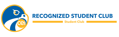
Student Organizations
Logo Usage
All Student logos that are not available here are to be presented and approved by head of marketing. All new clubs/organizations must be approved by proper authorities prior to receiving a logo. The Falcon Head graphic is the only graphic to be used to accompany club names and organizations. Alternate graphics may be created for design on approved swag, but must be accompanied by approved logos. No alternate logos are permitted to be created for any school club or organization. Club logos should appear as a footnote on the bottom of all printed material such as posters, fliers, brochures, etc. The logo should be used as provided, not altered or recreated.
Falcon Head Logo
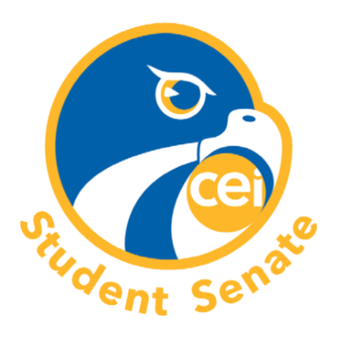
Falcon Head Logo
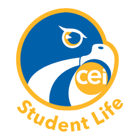
Student Club Logos

Department Logos
There are instances where a department logo fits nicely in place of the official CEI logo. For instance, if a flyer is highlighting the Counseling Center's services or when a single department hosts an event.
The department logo is currently not necessary in any circumstance. Use it only as applicable to your own department.
Standard


Horizontal
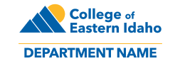

Sun Dot
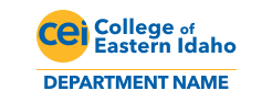
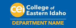
Sun Dot Seal
Logo Usage
Sub-logos for individual departments are to identify. Consistency is vital in establishing trust with the community and partners that we interact with. CEI department sub-logos must be used in a uniform manner by all departments, offices, and employees within the college. Our sub-logos may NOT be altered in any way and should appear in the CEI main color version, reverse version, or grayscale versions. sub-logos are created by members of Creative Services, per request and approval by head of Marketing. Sub-logos are not to be altered in any manner. Don’t list more than one department name to identify, use separate logos to identify each department. Do not use the official CEI logo and a department logo on the same publication.
Color Pallete
Our official colors are blue and gold.
RBG: 0, 96, 169
CMYK: 100, 60, 0, 6
Pantone: PMS 286

RGB: 253, 183, 39
CMYK: 0, 31, 94, 0
Pantone: PMS 123

RGB: 255, 255, 255
CMYK: 0, 0, 0, 0
Blue is often a background color, and a main color throughout every CEI product.
Gold is our accent color, for emphasis and high contrast. It shouldn’t be used as a piece’s background, as the CEI sun is always gold, and all parts of the logo should always stand out.
White is an unofficial but often-used color, especially on blue backgrounds. White is another common background choice.
Additionally, for small extra elements, the 2 grays below are also part of the brand standards:
RGB: 225, 225, 225
CMYK: 10, 8, 8, 0

RGB: 74, 74, 74
CMYK: 66, 59, 57, 39
Gradient
CEI has one official gradient using our blue as the base. Its subtle tone maintains the brand’s clean look while adding a little interest to many products.
RGB: 0, 114, 188
CMYK: 100, 50, 0, 0
RGB: 0, 72, 145
CMYK: 10, 75, 0, 16
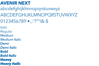
Typography
Avenir Next is for headings, body text, taglines, sections, and other main typographic points.
Garamond is used as a secondary typeface, serves as body text and better suits formal pieces.
Do not use squished or condensed versions of any typeface.
Bullets are always yellow, and work well as dividers, too.

Separate CEI's address, email, and phone number on a single line with a yellow dot.

Use periods for phone numbers.

Acceptable Typeface Substitutes:
Avenir Prompt (found at Google Fonts)
Garamond: Georgia or Minion (default fonts for most tech)

Creative Services
Robertson Bldg. 2 Room 285 | M-F 8:00am - 5:00pm | Summer hours: 7:30am - 4:00pm